We no longer experience the digestion of Internet content the way it was once delivered – back when the Internet solely gave us white backgrounds with paragraphs of Times New Roman text pasted on top. If you aren’t integrating graphics into your social media posts, blogs, or website content, it’s time to fix the flux capacitor of your DeLorean DMC-12 and jet out of 1969.
Thanks to Facebook, Twitter, Pinterest, Instagram, etc., striking graphics with glowing filters have become a trend as well as an attention grabbing strategy. To quote an ancient Chinese proverb, “Tell me I forget. Show me, I remember. Involve me, I understand.” Graphics within social media, blogs, and websites have the ability to show information and engage the reader, which reinforces memorability and understanding. Not only that but, content with relevant images receives 94 percent more views than content without.
Take into consideration the following examples:
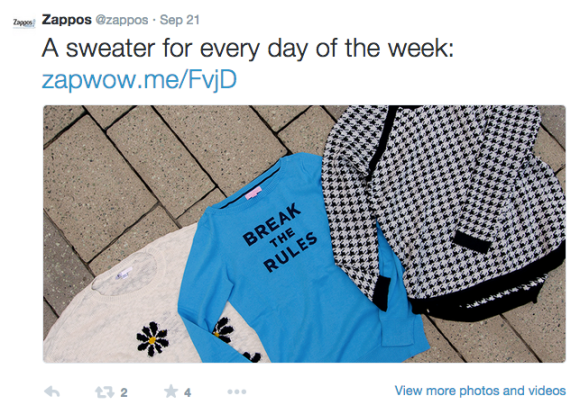
1.) Zappos – Success in social media
After exploring the Zappos’ Twitter page, within the last 48 hours more than half of Zappos’ tweets contained some type of visual. I proceeded to compare their eight most recent graphic containing tweets with their eight most recent non-graphic containing tweets. The posts with visuals had double the amount of favorites and retweets than the posts without a visual. BufferSocial ran their own numbers and found that tweets received 150% more retweets when an image was attached. Software Advice and Adobe also discovered that people think images are the most important factor in optimal social media content.
2.) Mashable – Success within a website and its blog posts
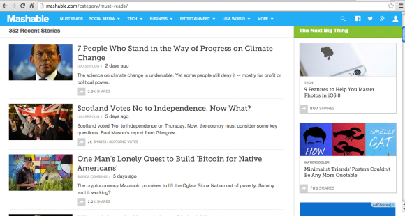
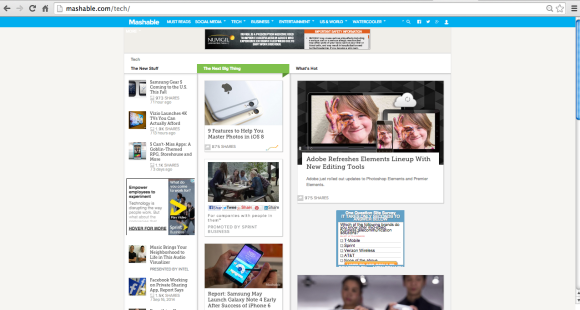
Mashable, a British-American news website, technology, and social media blog, is a popular and successful website that uses images across all its pages. Click through their various topic tabs, and you cannot locate one post that doesn’t have an image attached to it. They effectively use visuals and keywords together, relying on those two factors to draw people in and spark interest. Most of this can be linked back to Mashable’s visual transformation in 2012. They acknowledged their audience’s desire for bigger and better images and, in return, found it was more digestible for readers.


It’s true – humans are primarily visual creatures. We don’t just want to read about last night’s football game, we want to see the big play happen from the stands. Although your content may be strong, visuals are the key to grabbing attention and leading readers to your information. Therefore, allow images to act as the tour guide of your content. As they say, a picture is worth a thousand words.


