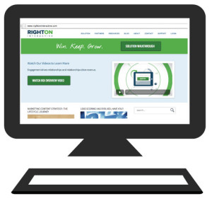
In the last decade, online buying and browsing has grown to become a normal part of our everyday lives. From self-purchases to gifts for others, we have evolved into a culture that explores the various realms of the Internet in order to gather information regarding specific products. We read numerous online reviews, compare different company prices, and hope that in the end we are able to attain the highest quality product on the market. However, another key factor in the consumer decision-making process is the influence of marketing videos on company landing pages.
 After exploring websites of well-known businesses such as Coca-Cola, Apple, Dropbox, and Red Bull, there was one common theme amongst each of these sites: landing page videos. Whether it was showcasing their latest projects or explaining the website and its product(s), each company took advantage of what video, as a medium, had to offer. Through motion, visuals, and sound, companies such as Apple, Red Bull, Dropbox and Coke—as well as many others—obtain the ability to establish validity and credibility. For example, in its early startup stages, Dropbox used an explainer video on its landing page to explain the value in joining the site, which in return, increased its conversion rates by over 10 percent.
So what makes a marketing landing page video successful?
According to Crazyegg, only 28% of the words on an average page of a website are actually read, while video holds attention for approximately 2.7 minutes. It makes sense; would you rather watch and visually see how something works, or read an instruction manual? With video you have the ability to deliver a message exactly how you want it perceived by your customer. You have control over what your customer will see and the facts they’ll be delivered (power that should be taken by the reigns).
Below is Apple’s current landing page video for the iPhone 5s, which grabbed my attention for the following reasons:
- The message was clear and the video wasn’t too long.
- The video showcased the product’s various abilities and functionalities.
- It was relatable to its target consumer.
- It was visually stimulating and text was used only at the end for an effective tagline.
Chances are if a customer has made the effort to visit your website, they are at an integral part of their decision-making process. They most likely have done their research and are looking to get the facts straight from you; so don’t just tell your customers what you have to offer, show them what you have to offer.
Check out Right on Interactive’s landing page video.
