Is one of your 2016 marketing goals the implementation of an email marketing platform? Perhaps you have a marketing automation tool, but would like to strengthen the emails you are sending. Things are always changing in the digital world and we at ROI are blueprinting email designs and testing new ideas all the time – just like anyone else. So what made us successful in 2015 as well as years past? Below are five tips to keep in mind as you begin executing your email marketing campaigns this year.
Spend adequate time on your subject line. This is something we’ve all heard many times, but it’s extremely important to brainstorm a handful of subject lines and rework those ideas until you have something solid. At Right On Interactive, we have one person who focuses specifically on what the subject line will be for the specific email and week. We then collaborate as a team and pick the option we feel is the strongest. Another tool we find extremely helpful is called: subjectlinegold.com. This tool helps us tweak ideas we came up with and offers helpful and useful tools for comparing subject lines.
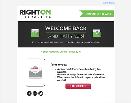
Utilize the “ghost text” effect within your emails. This is a technique we implemented last year and have found it to be quite useful. We noticed the line “View it in your browser” was appearing directly after the subject line (this was a result of it being the first detected line of text within the email). Ultimately, it was wasted preview space that could have been filled with content that was more enticing for the viewer. Therefore, in the preheader section of the email we inserted a short sentence (about 60-100 characters) before the “View it in your browser” line. We then changed that text color so that the sentence would blend into the background of the email, giving it an invisible effect when opened. It’s a simple way to eliminate the “View it in your browser” text in the preview and acts as a secondary subject line.
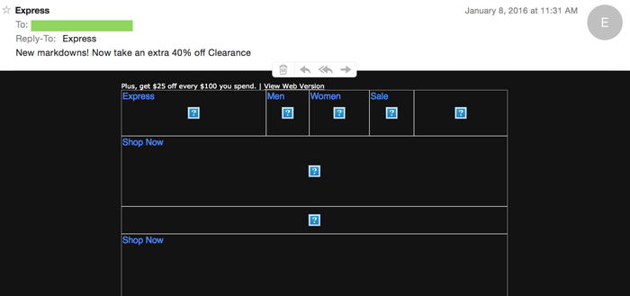
Always add descriptions with images. Failing to add an image description can hurt you in the long run in terms of email performance. Because many email providers block images, the viewer will instead see the alternate text or text description in replace of the image. This is also true if the images fail to load or if the connection is poor when the individual opens the email. The alternative text that appears essentially guides the reader through the email in case the images fail to appear.
Be sure to balance your text-to-image ratio – To minimize your spam score, it’s important that you don’t over saturate your emails with too many graphics. A good rule of thumb is to have at least two lines of text for every image. Simply decreasing the size of the image can help lower or eliminate the spam score as well. Emails that follow an all-image based design pose the risk on showing up completely blank as some email client’s default setting automatically block images (see above).
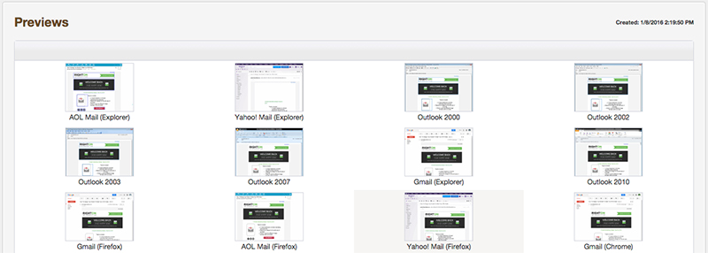
Preview your email to ensure consistency – There is nothing worse than sending the live version of your email (that you tested countless times) only to realize that when someone views it in Outlook, for example, it looks extremely different than how it originally appeared when you viewed it using your Gmail account. The best way to be sure your email is appearing consistent across all email providers is to preview it (ROI’s platform utilizes Litmus) before you send the live version.
To learn more about email tips and best practices, check out 7 Email Marketing Design Tips for 2016.


